P2-13.1 What Does a Plot Reveal?
Section ID:
P2-13.1Version:v2026.07.23
In Part 2 Chapter 11, we checked calculations with NumPy arrays. In Part 2 Chapter 12, we read tabular data with a Pandas DataFrame. Now we look at the same numbers as pictures.
Tables are good for exact values. But once the number of values grows, it becomes hard to answer the following questions from a table alone.
- Are the values increasing or decreasing?
- Is one value standing out sharply?
- Are two values moving together?
- Are the data crowded on one side?
- Does the calculation result look similar to the shape I expected?
A plot is not decoration that makes numbers look pretty. It is a tool for checking shape, trend, relationship, and distribution that do not appear immediately in a table. You need this tool first so that, in Part 3, you can read learning curves, error distributions, and relationships between variables not as a list of numbers but as interpretable shapes.
This section explains the basic distinctions among plot, Figure, Axes, distribution, and outlier. If the previous chapter asked how a bundle of numbers should be read as a table of cases and variables, this section asks what kind of shapes should be used to inspect changes and relationships that do not stand out directly in the table. Plotting is not the stage where you decorate results. It is the stage where you first check patterns that are easy to miss in a table, such as loss changes, skewed distributions, and relationships between variables. In Chapter 14, we will look at how to leave a record of what changed and what differed from expectation after seeing these plots. When you continue to chart choice and saving results, also check the Concept Glossary.
Core Criteria: What Does a Plot Reveal?
- You can explain a plot as a tool for checking the shape of data.
- You can explain the difference that tables are strong at exact values while plots are strong at checking patterns.
- You can explain that trend, relationship, distribution, and outliers can be checked with plots.
- You can distinguish Matplotlib's
Figureas the "whole picture" andAxesas the "coordinate area where the picture is drawn." - You can explain that the impression given by a plot does not always mean a cause or a conclusion.
Three Criteria
| Criterion | Why It Matters | Required Understanding in This Section |
|---|---|---|
| Why is a table alone not enough? | It clarifies the difference in role between tables and plots. | Understand that some shapes and tendencies do not appear from a list of numbers alone. |
| What does a plot show well? | It helps you read later chart choices as question-centered rather than as a list of names. | Understand it as a tool that lets you read questions such as trend, comparison, and distribution more quickly. |
| What should be decided first? | It pushes you to set the interpretation question before memorizing chart names. | Understand that you should decide what question to ask before choosing a chart type. |
| Term | Meaning to Hold First in This Section |
|---|---|
| plot | A picture used to check the shape, change, and relationship of numerical data visually. |
| Figure | The large area where the whole plot sits. |
| Axes | One coordinate area where the actual data are drawn. |
| distribution | The shape that shows where values gather and how widely they spread. |
| outlier | A value that stands out unusually compared with the others. |
Tables Are Strong at Values, and Plots Are Strong at Shape
Look at the following table.
| epoch | loss |
|---|---|
| 1 | 2.40 |
| 2 | 1.65 |
| 3 | 1.12 |
| 4 | 0.86 |
| 5 | 0.79 |
From the table, you can read each exact value. But when you want to check quickly whether training is going well, the overall flow often matters more than each value one by one.
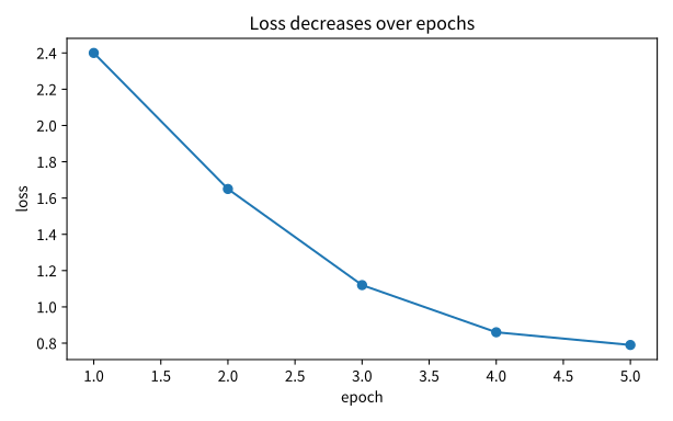
If you draw the same data as a line plot, you can see more quickly that the loss is generally decreasing.
Problem situation: the numbers in the table are precise, but it is hard to grasp at a glance how the value changes across repeated steps. Input: five epoch numbers and five loss values. Expected output: a line plot that shows how loss changes as the epoch count increases. Concept to check: a table reveals the values themselves, while a plot reveals the shape of change more quickly, so ordered values such as training loss are naturally read with a line plot.
When you run the code above, you can check a shape where the loss falls as the epoch count increases.

The asset folder for this book also keeps a save-oriented script that can recreate the same example as a file. Use plt.show() as above when checking it directly on screen, and run p2_13_1_plot_questions.py when recreating the PNG files used in the document.
The important point in this example is not the code syntax but the question, "Does the loss value decrease through repeated learning?"
Tables tell you the exact values, and plots show you the shape of change.
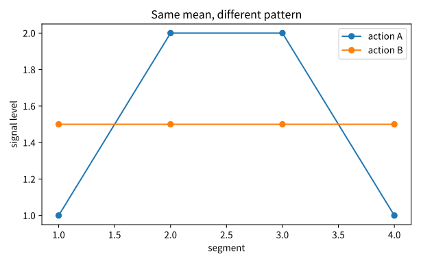
Take one more step. Even if summary numbers look the same, the shapes of the plots can differ. For example, even if the mean of a one-run summary is 1.5 in both cases, one case may stay almost flat from beginning to end while another may rise sharply in the middle and then fall again. If you look only at the mean in a table, the two may look similar. A line plot makes you check again whether that seems similar really is the same pattern.
| Recorded action | Mean | What a Plot Shows More Clearly |
|---|---|---|
| A | 1.5 | Whether it stays almost flat |
| B | 1.5 | Whether it rises and falls sharply in the middle |
In other words, a plot is not a tool for rewriting numbers more beautifully. It is a tool that makes you check again the shape of movement that a single representative value in a one-row summary can easily miss.
You can write the same scene in a more table-like way as follows.
| action_id | sensor_a_mean | sensor_a_std | early_segment_mean | late_segment_mean |
|---|---|---|---|---|
| B-201 | 27.0 | 0.4 | 26.8 | 27.2 |
| B-202 | 27.0 | 1.6 | 25.5 | 28.5 |
This table shows that the mean can be the same even though the variability and segment pattern differ. So if the table already makes you suspect that "the mean is the same, but the structure may differ," the plot becomes the next step that checks that suspicion as an actual shape.
The key point here is that a plot may show more clearly whether there is a pattern difference, but it does not automatically explain the cause of that difference.
Problem situation: you want to compare directly, with a line plot, two actions that have the same mean but different patterns. Input: lists of values by segment for two actions. Expected output: two line plots whose means are the same but whose shapes differ. Concept to check: a line plot can reveal again a difference that a single summary number such as the mean misses.
In this plot, the reader should check the following three points first.
- Even if the means look similar, the internal structure can differ.
- A table creates the suspicion that they
look the same, and the plot lets you check whether that suspicion is a real pattern difference. - A plot reveals a pattern difference that a single table mean can easily miss.
- Even when the mean is the same, the pattern can differ, but the plot does not automatically state the cause.
Four Questions a Plot Reveals
Here, we treat plots as tools that answer the following four questions.
| Question | What the Plot Helps With | Example |
|---|---|---|
| trend | Look at how a value moves across time or order | loss by training epoch |
| relationship | Look at whether two values move together | study hours and score |
| distribution | Look at where values are concentrated | score distribution, error distribution |
| outlier | Look at whether one value stands out sharply | sensor error, input error |
These four questions keep returning later.
- In machine learning, you look at loss and metrics during training.
- In data analysis, you look at relationships and distributions among variables.
- In deep learning, you look at learning curves, prediction error, and embedding visualization.
So the goal is not "I know how to draw a picture." The goal is "I ask what shape the numbers are making."
The Same Numbers Can Look Different Depending on the Question
For example, look again at the data of four students.
| name | study_hours | score |
|---|---|---|
| Kim | 2 | 62 |
| Park | 4 | 71 |
| Lee | 6 | 82 |
| Choi | 8 | 88 |
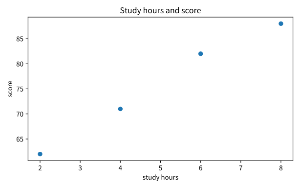
If you want to see the values themselves in this table, you can read the table directly. But if you want to ask, "As study time increases, does the score also rise?", a scatter plot is more natural.
Problem situation: when you want to see whether two values move together, the arrangement of points may be easier to read than a table. Input: the list study_hours and the list scores. Expected output: a scatter plot that expresses each student as one point. Concept to check: a scatter plot shows a candidate relationship between two variables and their spread at the same time.
The output appears as four points. A shape where the points extend toward the upper right makes you ask whether the two values increase together.

This plot does not prove a cause. It simply helps you check quickly the shape in which two values move together.
This distinction matters.
- A plot can make something look like a relationship.
- But looking like a relationship does not prove a cause.
- A plot is the starting point of judgment, not the end of judgment.
In Matplotlib, Distinguish Figure and Axes First
The Matplotlib documentation explains that data are drawn as plots on a Figure. A Figure is the whole picture, and it can contain one or more Axes. An Axes is the coordinate area where the actual data are drawn.
Here, understand them as follows.
| Term | Intuition |
|---|---|
Figure | The whole sheet of paper |
Axes | The panel where coordinates and data are actually drawn |
plot, scatter, hist | Functions that decide how data are drawn on the Axes |
So we use the following form as the default example here.
Problem situation: you want to see first, in the smallest code possible, how Matplotlib creates Figure and Axes together. Input: a short list of x values, a short list of y values, and a call to plt.subplots(). Expected output: a simple line plot drawn on one Figure and one Axes. Concept to check: plt.subplots() creates the whole picture and the coordinate area together.
plt.subplots() creates a Figure and one Axes together. Then you draw data on the Axes with something like ax.plot(...).
You often see shorter examples such as plt.plot(...). But if you get used to the fig, ax = plt.subplots() form, it is easier later to understand the flow when you place multiple plots on one screen or adjust the title, axis labels, and legend.
The Question Comes First, and the Chart Type Comes Later
The Matplotlib documentation provides many plot types. Basic forms such as line plots (plot), scatter plots (scatter), bar charts (bar), and histograms (hist) are representative.
But memorizing chart types from the beginning is not a good approach. Decide the question first.
| Question to Ask First | Plot Often Used |
|---|---|
| Do you want to see change across an order? | line plot |
| Do you want to see the relationship between two values? | scatter plot |
| Do you want to compare sizes by category? | bar chart |
| Do you want to see where values are concentrated? | histogram |
This table is a starting point, not a rule. The actual chart choice can vary depending on the shape of the data, the reader's question, and the message you want to deliver.
Plots Compress Numbers onto One Screen
Plots compress many numbers onto one screen. That is why they help you see patterns quickly, but it also means you need to be careful.
For example:
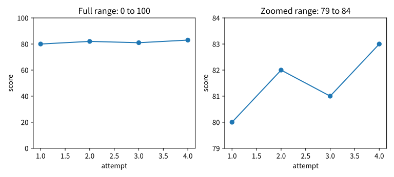
- Changing the axis range can make a change look large or small.
- If there are only a few points but you connect them with a line, the change can look more continuous than it really is.
- If you overuse color or area, an unimportant difference can look large.
- If you draw only the mean, the distribution or outliers can disappear.
When you read a plot, keep the following questions with it.
- What are the x-axis and y-axis?
- What does one point or one line mean?
- Is there any missing value or hidden range?
- Is what the plot shows an observation or an interpretation?
If you do not ask these questions, a plot can create misunderstanding instead.
Build the Habit of Checking Plots with Small Code
Plots are not used only in polished reports. During learning, they are tools for checking quickly whether "my calculation is going in the right direction."
For example, if you look only at the mean, you can miss the shape of the data.
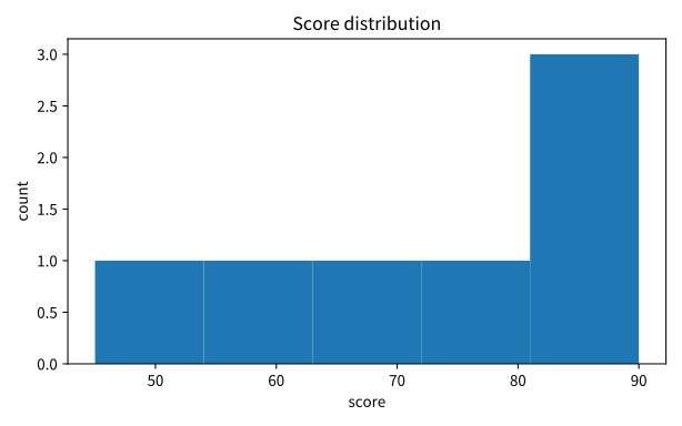
Problem situation: with one mean value alone, it is hard to know the concentration and spread of scores, so you want to inspect the distribution directly. Input: the list scores for several students. Expected output: a histogram that shows the count of scores by interval. Concept to check: to see a distribution, you need to visualize where values are concentrated rather than only calculate the mean.
The output shows in which intervals the score values are concentrated.

This code does not calculate the average score. Instead, it checks where the scores are concentrated.
P2-13.2 handles these basic plots a bit more concretely. In this section, first accept plots as tools for checking the shape of numbers.
If you compress the role of this section into one line, it becomes the following.
| What Came Right Before | What This Section Does | What the Next Chapter Continues |
|---|---|---|
| Numbers checked with NumPy arrays and Pandas tables | Read the shape, change, and relationship of numbers quickly with plots | Leave records, with Git and reproducibility standards, of what was changed after reading those plots |
Case Study
Case 1. When You Have a Loss Table but Cannot Yet Feel Whether Training Is Going Well
Suppose a learner organized the loss values by epoch in a table. All the numbers are visible, but it is hard to judge quickly from the table alone whether the loss decreases smoothly, whether there is a sudden jump in the middle, or whether the whole flow matches the expectation.
The human first standard is often, "The values are written down, so this should be enough." But as the number of values grows, what matters is often the shape and flow more than each number by itself. A plot is the tool that lets you see exactly that shape of numbers.
That is why this section explains plots not as decoration but as tools for asking about change, relationship, distribution, and outliers. Tables are strong at exact values, and plots are strong at pattern checking. So they are not competing with each other. They answer different questions.
The checkable result becomes clearer when you draw the same data as a line plot. If it becomes easier than with the table to see whether the loss is generally falling, whether it wobbles at a specific epoch, and where the values are concentrated, then the reason to draw the plot becomes clear.
Checklist
- Can you explain what kinds of questions tables and plots are each strong at?
- Can you explain that trend, relationship, distribution, and outliers can be checked with plots?
- Can you state the difference between
FigureandAxesintuitively? - Can you say what questions line plots, scatter plots, bar charts, and histograms are often used for?
- Can you check axis meaning, point meaning, hidden range, and over-interpretation when reading a plot?
- Can you remember that a plot is the starting point of judgment and does not automatically prove a cause or conclusion?
Sources and References
- Matplotlib Developers,
Quick start guide, Matplotlib documentation, checked on 2026-07-20. https://matplotlib.org/stable/users/explain/quick_start.html Used as the basis for distinguishingFigure,Axes, andplt.subplots(). - Matplotlib Developers,
Plot types, Matplotlib documentation, checked on 2026-07-20. https://matplotlib.org/stable/plot_types/index.html Used for mapping line, scatter, bar, and histogram plots to common data questions. - Matplotlib Developers,
matplotlib.pyplot, Matplotlib API reference, checked on 2026-07-20. https://matplotlib.org/stable/api/_as_gen/matplotlib.pyplot.html Used to verify the introductorypyplot-style examples.