Skip to content

P2-13.2 Basic Charts and Checking the Shape of Formulas

Section ID: P2-13.2 Version: v2026.07.23

In P2-13.1, we treated a plot as a tool for checking the shape of numbers. Now we connect a few basic chart types directly.

The core of this section is not "memorizing Matplotlib function names." It is building the sense of setting the question first and then choosing the chart that fits that question.

This section explains the basic distinctions among the line plot, scatter plot, histogram, and loss curve. The representative explanation of the role of a plot itself and of Figure and Axes stays in P2-13.1 and the Concept Glossary. Here, we focus on which basic chart to choose first for which question.

Reading the Same Learning Scene with Different Questions

Instead of giving each chart a completely different world as an example, this section rereads the scene of checking a learning process through several questions.

Question Asked in the Same Scene Chart to Recall First Why This Chart Fits
How does loss change as epochs pass? line plot Because the key is change across an order.
As the input value grows, does the observed value also grow? scatter plot Because you need to see both the sample-by-sample relationship and the spread.
In which intervals do scores or measurements gather? histogram Because you want to inspect distribution and concentration.

Even in the same scene, if the question changes, the chart choice also changes. If you hold on to this connection, what stays longer is not the chart name but the question-chart match.

Core Criteria: Basic Charts and Checking the Shape of Formulas

  • You can distinguish the basic purpose of a line plot, scatter plot, and histogram.
  • You can calculate the shape of a formula in code and check it with a chart.
  • You can ask questions about the learning flow by looking at a loss curve.
  • You can explain why a chart needs axis labels and a title.
  • You can hold the perspective that a chart is not a conclusion but a checking tool.

Three Criteria

Criterion Why It Matters Required Understanding in This Section
When is a line plot used? It helps you distinguish a chart for ordered values from a chart for related values. Understand that it is used when you want to see change across order or time.
How are a scatter plot and a histogram different? It helps you read relationship and distribution as different questions. Understand that one inspects the relationship between two values, while the other inspects where values gather.
Why are the title and axis labels important? It makes clear that chart interpretation does not end with the picture alone. Understand that chart interpretation is completed together with words, not by the picture alone.
Term Meaning to Hold First in This Section
line plot A chart that connects value changes across order or time with lines.
scatter plot A chart that shows the relationship and spread of two variables with points.
histogram A chart that shows how much values gather in each interval.
loss curve A line plot that shows how loss changes as training repeats.
axis label Text that explains what the horizontal and vertical axes mean in a chart.

A Line Plot Shows Change Across Order

A line plot is often used when the order on the x-axis matters. It fits cases where there is a flow read from left to right, such as time, iteration count, training epochs, or continuous change in an input value.

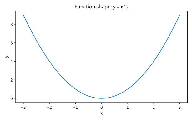
A line plot is also basic when checking the shape of a formula. For example, you can make \(y = x^2\) as a table of numbers, but if you draw it as a chart, the U-shape appears immediately.

Problem situation: if you list formula values in a table, the exact numbers appear, but it is hard to catch the whole curve shape immediately. Input: continuously changing x values and the computed values of \(y = x^2\) corresponding to each x. Expected output: a line plot that shows the whole shape of \(y = x^2\). Concept to check: a line plot is suitable for checking the shape of a function across continuous input changes, and the axis labels and title should clarify what question the chart answers.

# This example draws line plots, scatter plots, bar charts, and formula curves to match chart shape to the question.
import matplotlib.pyplot as plt
import numpy as np

x = np.linspace(-3, 3, 121)
y = x**2

fig, ax = plt.subplots()
ax.plot(x, y)
ax.set_xlabel("x")
ax.set_ylabel("y")
ax.set_title("Function shape: y = x^2")
plt.show()

The output looks as follows.

Function shape for y equals x squared

The PNG example assets in this section can be recreated with p2_13_2_basic_chart_shapes.py. The code in the body is the minimum code for reading chart choice and Axes usage, while the asset script is reproducibility code that leaves the same input conditions as file outputs.

What this graph shows is not a solution process but a shape.

  • It is lowest near \(x=0\).
  • As \(x\) moves farther away in either direction, \(y\) grows.
  • The slope changes depending on the position.

This check connects directly to the intuition for derivatives, gradients, and loss functions discussed in P2-4.

A Scatter Plot Shows the Relationship Between Two Values

A scatter plot marks each sample as one point. It is useful when you place different values on the x-axis and y-axis and want to check whether the two values move together.

For example, if you want to know whether the observed value tends to grow as an input value grows, you can use a scatter plot.

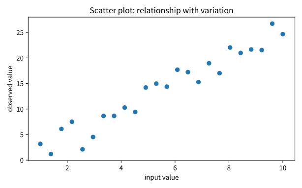
Problem situation: you want to check by eye whether two values grow together and how widely the points are spread. Input: continuous x values and the observed values y mixed with noise. Expected output: a scatter plot where the relationship direction and variation are visible together. Concept to check: a scatter plot shows both a candidate relationship and the spread caused by variation or noise.

# This example draws line plots, scatter plots, bar charts, and formula curves to match chart shape to the question.
import matplotlib.pyplot as plt
import numpy as np

rng = np.random.default_rng(42)
x = np.linspace(1, 10, 24)
y = 2.5 * x + rng.normal(0, 2.2, size=x.shape)

fig, ax = plt.subplots()
ax.scatter(x, y)
ax.set_xlabel("input value")
ax.set_ylabel("observed value")
ax.set_title("Scatter plot: relationship with variation")
plt.show()

The output looks as follows.

Scatter plot showing a relationship with spread

In this plot, the points are not on one perfect line. But there is still a flow that goes generally upward as you move to the right.

Read it in the following way.

  • One point is one sample.
  • The direction of the point cloud shows a candidate relationship.
  • The spread of the points shows variation or noise.
  • Do not conclude a cause from a scatter plot alone.

A Histogram Shows Where Values Gather

A histogram divides values into bins and shows how many values fall into each bin. If you look only at one mean, you can miss where the data gather.

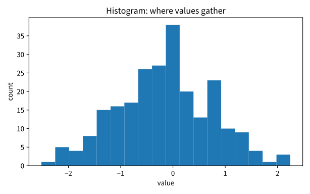
Problem situation: from the mean value alone, it is hard to know where the sample values are actually concentrated. Input: a list of sampled values drawn from a normal distribution. Expected output: a histogram that shows the count of each value interval. Concept to check: a histogram helps you check concentration, skew, and rare intervals of values.

# This example draws line plots, scatter plots, bar charts, and formula curves to match chart shape to the question.
import matplotlib.pyplot as plt
import numpy as np

rng = np.random.default_rng(7)
values = rng.normal(loc=0, scale=1, size=240)

fig, ax = plt.subplots()
ax.hist(values, bins=18)
ax.set_xlabel("value")
ax.set_ylabel("count")
ax.set_title("Histogram: where values gather")
plt.show()

The output looks as follows.

Histogram showing where values gather

When reading a histogram, ask the following questions.

  • In which interval do the values gather most?
  • Is it skewed to one side?
  • Are there rare values at the two ends?
  • Is there a shape that the mean alone would miss?

These questions connect directly to distribution, mean, and variance in P2-5.

A Loss Curve Checks the Learning Flow

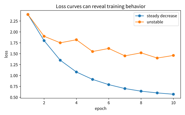
In AI learning, we often check how loss changes during repeated training. Here, a line plot is not simply a pretty way to draw a formula. It becomes a tool for checking whether learning is moving in the expected direction.

Problem situation: you want to compare the learning flow by placing a steadily decreasing loss and a shaking loss side by side. Input: epoch numbers and two loss lists, decreasing_loss and unstable_loss. Expected output: a comparison line plot where the two loss curves appear together. Concept to check: a loss curve helps you check quickly whether learning is stable and whether it shakes in the middle.

# This example draws line plots, scatter plots, bar charts, and formula curves to match chart shape to the question.
import matplotlib.pyplot as plt
import numpy as np

epochs = np.arange(1, 11)
decreasing_loss = [2.4, 1.8, 1.35, 1.08, 0.91, 0.79, 0.70, 0.64, 0.60, 0.57]
unstable_loss = [2.4, 1.9, 1.75, 1.82, 1.55, 1.62, 1.45, 1.52, 1.40, 1.46]

fig, ax = plt.subplots()
ax.plot(epochs, decreasing_loss, marker="o", label="steady decrease")
ax.plot(epochs, unstable_loss, marker="o", label="unstable")
ax.set_xlabel("epoch")
ax.set_ylabel("loss")
ax.set_title("Loss curves can reveal training behavior")
ax.legend()
plt.show()

The output lets you compare the two flows as follows.

Line plot comparing steadily decreasing and unstable loss

You should not look at this plot and conclude immediately, "This is a good model." But you can ask the following questions.

  • Is the loss generally decreasing?
  • Does it shake strongly in the middle?
  • From which point does the speed of decrease slow down?
  • Do you need to split train loss and validation loss?

The last question leads to overfitting, validation, and generalization in Part 3.

Axes, Titles, and Labels Are Part of Interpretation

In a chart, the axis, title, and labels are not extra decoration. They are part of the standard by which the reader judges what they are looking at.

A bad chart draws numbers but hides the question.

Problem situation: without axes and a title, it is hard to know immediately what a chart is showing. Input: minimal code with only one line, ax.plot(x, y). Expected output: incomplete chart code where a line appears but the question is not visible. Concept to check: chart code is not complete just because it draws data; interpretation information is needed too.

# This example draws line plots, scatter plots, bar charts, and formula curves to match chart shape to the question.
ax.plot(x, y)

By contrast, if you add the axes and title like this, it becomes much clearer what question the chart answers.

Problem situation: you want to make the question explicit by adding axis names and a title to the same chart. Input: code that adds x-axis, y-axis, and title settings to ax.plot(x, y). Expected output: more descriptive chart code from which the reader can tell what was drawn. Concept to check: axis labels and a title are part of chart interpretation.

1
2
3
4
5
# This example draws line plots, scatter plots, bar charts, and formula curves to match chart shape to the question.
ax.plot(x, y)
ax.set_xlabel("x")
ax.set_ylabel("y")
ax.set_title("Function shape: y = x^2")

Here, you should build the habit of including at least the following three elements.

Element Role
x-axis label Explains what the horizontal value means
y-axis label Explains what the vertical value means
title Summarizes the question this chart is trying to answer

Summarizing Basic Chart Choice in One Sentence

You can choose basic charts as follows.

What You Want to See Chart to Recall First
Change across an order line plot
Relationship between two values scatter plot
Concentration and spread of values histogram
Change during the learning process loss curve

This table is not a formula to memorize. It is a starting point for checking what question you are asking the data.

Case Study

Case 1. When You Do Not Know Which Chart to Use and End Up Drawing Any Chart

Suppose a learner has both training logs and score data. Loss is recorded by epoch, study time and score are paired by sample, and test scores are gathered at once across many students. In other words, this is a situation where the same learning scene must be reread through three different questions.

At first, a person easily thinks, "I need to draw one graph, so let me just draw anything." But if the question changes, the chart must also change. A line plot is more natural for loss changes, a scatter plot is more natural for two values moving together, and a histogram is more natural for where values gather.

This is why the section tells you to look first at what question am I asking? rather than at chart names. Even with the same data, the chart choice changes depending on whether you want to see change, relationship, or distribution.

The checkable result appears when you switch the chart. If you draw loss by epoch as a line plot, the flow appears clearly. If you draw the same data as a histogram, the question becomes blurred. By contrast, score distribution appears more clearly in a histogram.

Checklist

  • Can you check the shape of \(y = x^2\) with a line plot?
  • Can you explain what one point means in a scatter plot?
  • Can you explain that a histogram shows information different from the mean?
  • Can you create questions about the learning flow by looking at a loss curve?
  • Can you explain why x-axis, y-axis, and title should be added when making a chart?
  • Can you explain that line plots, scatter plots, histograms, and loss curves should be chosen by the question of change, relationship, distribution, or learning flow, and that axes, titles, and labels are part of interpretation.

Sources and References