P2-13.3 Comparing and Saving Multiple Plots
Section ID:
P2-13.3Version:v2026.09.15
Viewing Loss and Accuracy Side by Side
In this fictional training record, loss falls from 2.02 to 0.60 and accuracy rises from 0.55 to 0.88. Accuracy is the fraction of predictions that are correct. Since the metrics have different meanings and numeric ranges, compare them in separate panels with their own y-axes.
The output places two related questions in separate panels within one Figure.
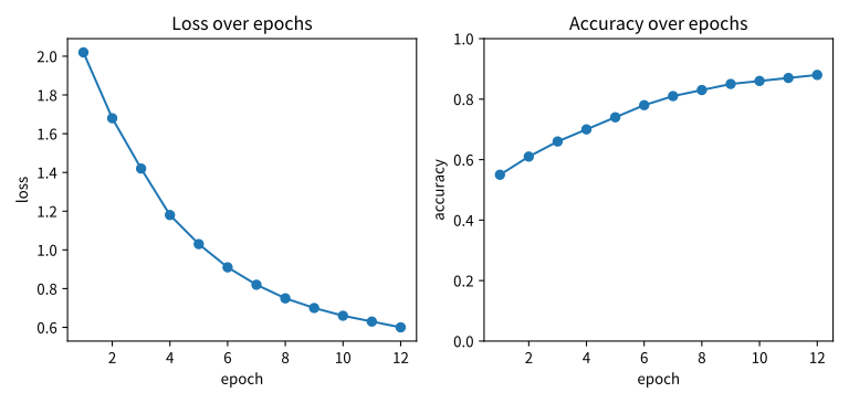
plt.subplots(1, 2) creates one figure and two coordinate regions. axes[0] is the loss plot on the left and axes[1] the accuracy plot on the right. Both x-axes represent the same 12 iterations.
Over the last three iterations, loss changes 0.66 → 0.63 → 0.60 and accuracy changes 0.86 → 0.87 → 0.88. Separate axes let each change be read against its own scale.
Overlaying Training and Validation Loss
Separate panels are not always preferable. For values in the same units, putting two lines on one Axes can make comparison more direct.
Training and validation loss can share a y-axis when calculated with the same loss function and aggregation rule. In this fictional record, training loss keeps falling while validation loss rises after reaching 0.88 at iteration 8.
The output compares both loss curves on one axis.
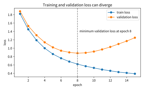
This pattern can suggest overfitting. If training loss keeps falling while validation loss rises, the model may be fitting training data better but new data less well.
From iteration 8 to 15, training loss drops from 0.62 to 0.39 while validation loss rises from 0.88 to 1.25. The metrics move in opposite directions during the same period. Data splits and training conditions also need checking before determining the cause.
Saving Image Files
Colab and Jupyter Notebook can display plots with plt.show(). Books, reports, and experiment records also need saved image files.
Use savefig() in Matplotlib.
| Code | Meaning |
|---|---|
plt.show() | Display the plot in the current environment |
fig.savefig(...) | Save the figure to an image file |
fig.tight_layout() | Adjust spacing to reduce overlap of titles, labels, and panels |
The relative path creates files under .tmp/chapter-13-plots/ in the current working directory. This save code uses the preceding training/validation Figure. To save the first side-by-side figure, insert the save call before its plt.show(). Reusing fig can make it refer to a later figure, so check which object is being saved.
PNG is a pixel image. An 8×3.8-inch figure at dpi=160 has a default canvas of 1280×608 pixels. SVG stores lines and text as vectors, preserving outlines when enlarged. Using bbox_inches="tight" crops the saved extent and may change pixel dimensions.
A typical order is to create the figure, adjust labels and layout, call fig.savefig, and then plt.show(). After a blocking show() ends, plt.savefig() can save an empty new figure because the current one has closed. The example uses a retained Figure reference with fig.savefig(), but saving before show reduces environment-dependent confusion. For file-only batch work, close each figure with plt.close(fig) after saving.
Records Needed for Reproduction
An image shows a result but is not a reproducible record by itself. Recreating the same plot requires:
- Plotting code
- Data or data-generation conditions
- Libraries and their versions
- A random seed when random values are used
- The question the plot answers
A documentation project should therefore keep generating scripts alongside images when possible. Keeping the script near an image that will be revised repeatedly makes the result easier to reproduce.
This script saves the example SVGs in all three languages to the asset directory. Matplotlib uses the repository's .tmp directory as the default cache location.
Comparison Conditions
When comparing several plots, check the following:
| Check | Reason |
|---|---|
| Avoid forcing different units onto one axis | It can distort apparent changes |
| Compare same-unit values on a shared axis | Training and validation loss can be compared directly |
| Include a legend | Each line must be identifiable |
| Check axis ranges | Small differences can be exaggerated and large ones hidden |
| Use descriptive filenames | The plot should remain identifiable later |
Case: Recording an Accuracy Plateau
Change the last three accuracy values in the first example to [0.86, 0.86, 0.86] and rerun it. Loss continues falling while accuracy becomes flat from iteration 10. The fraction of correct predictions no longer rises despite decreasing loss.
After changing the first accuracy list, insert fig.savefig(output_dir / "loss-accuracy-plateau.png", dpi=160) before plt.show(). output_dir is the folder created in the earlier saving example. Save immediately after creating the modified figure to avoid saving a different, later fig.
Accuracy counts final correct decisions, whereas loss can reflect how close predicted values are to the target more finely. For a positive target with a classification threshold of 0.5, probabilities 0.6 and 0.8 both give the correct class, but binary cross-entropy falls from about 0.511 to 0.223. An accuracy plateau alongside falling loss is therefore not contradictory.
Keep both the original and modified accuracy lists when comparing this file with the original result. Different filenames alone do not identify changed inputs. Recording “last three accuracy values fixed at 0.86; loss list unchanged” alongside the generating code explains the difference between figures.
Checklist
- Can you explain why multiple panels help compare related questions?
- Can you explain that
plt.subplots(1, 2)creates two Axes in one Figure? - Can you explain why loss and accuracy use separate panels?
- Can you distinguish when to share an axis and when to separate different units?
- Can you distinguish
plt.show()fromfig.savefig()? - Can you explain what code and data records make a saved image reproducible?
Sources and References
- Matplotlib Developers, Quick start guide, Matplotlib documentation, accessed: 2026-07-20. Multiple Axes in one Figure.
- Matplotlib Developers, Introduction to Axes (or Subplots), Matplotlib documentation, accessed: 2026-07-20. Axes as the coordinate region for labels, titles, and legends.
- Matplotlib Developers, matplotlib.figure.Figure.savefig, Matplotlib documentation, accessed: 2026-09-15. Saving images and vector graphics with Figure.savefig.
- Matplotlib Developers, pyplot.show, accessed: 2026-09-15. show/save order and retaining a Figure reference.
- scikit-learn Developers, log_loss, accessed: 2026-09-15. binary cross-entropy for a positive sample.