P3-8.2 How Far Can We Describe Change Before Claiming a Cause?
Section ID:
P3-8.2Version:v2026.09.20
What can we say when recent values look higher than a reference in a chart? We can first describe the observed difference. The cause “because the sensor failed” is not contained in the chart. An interpretation boundary starts by separating observations, candidate causes, and records to check.
Read the same raw values as dots and boxes
We reuse the existing fictional measurement log from P3-4.1. Take one flow value per operation from the row where elapsed_seconds=2. The six operations with is_recent=0 form the Reference group; the six with is_recent=1 form the Recent group. Each dot is one operation's flow at two seconds, not a late-period mean or a within-operation decline rate.
| Group | Operation ID order | Flow in that order (L/min) |
|---|---|---|
| Reference | E02, E04, E06, E08, E10, E12 | 1.2, 1.0, 1.1, 1.1, 1.0, 0.9 |
| Recent | E01, E03, E05, E07, E09, E11 | 1.6, 1.8, 1.3, 1.5, 1.9, 1.7 |
These group flags serve a comparison exercise. Actual dates, equipment settings, and material batches are missing, so equal conditions and a normal reference group have not been established. Keep this limitation visible: observation coverage needs checking before interpreting the chart.
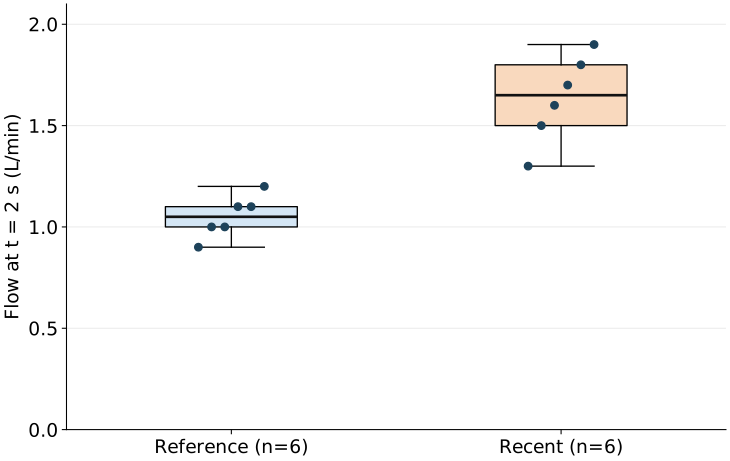
The horizontal axis separates Reference and Recent; it is not time order. The vertical axis is a shared flow scale in L/min. Dots are spread slightly sideways to avoid overlap, not to encode another variable. Here, whiskers extend to the minimum and maximum. Other box plots may use different whisker rules, so check their legends or descriptions.
The median is the middle of the sorted values. For six values, average the two central ones. Reference sorts to 0.9, 1.0, 1.0, 1.1, 1.1, 1.2, giving (1.0+1.1)/2=1.05. Recent sorts to 1.3, 1.5, 1.6, 1.7, 1.8, 1.9, giving (1.6+1.7)/2=1.65. The observed median difference is therefore 1.65−1.05=0.60 L/min.
The box runs from the lower quartile (Q1) to the upper quartile (Q3), summarizing the middle 50%. Here we split the six sorted values into the lower three and upper three, then take their respective medians as Q1 and Q3. Small-sample quartiles can differ across calculation methods; this example fixes that rule explicitly.
| Group | Q1 | Median | Q3 | Interquartile range Q3−Q1 (L/min) |
|---|---|---|---|---|
| Reference | 1.00 | 1.05 | 1.10 | 0.10 |
| Recent | 1.50 | 1.65 | 1.80 | 0.30 |
Recent's box is taller, showing greater spread in the central interval. Horizontal widths are set equal for display and do not encode dispersion. The interquartile range is not variance, and differences between six-observation groups do not establish long-term instability or a safety problem. Nor should these two groups be read as a trajectory increasing over time.
Pair one difference with several possible causes
“The observed Recent median is 0.60 L/min higher” reports a calculation. “It is 0.60 L/min higher because of sensor error” adds an unverified cause. The same high readings admit several possible explanations. The following table organizes hypotheses to check, not established events.
| Candidate cause | Records to check next | What to distinguish |
|---|---|---|
| The sensor reads above the actual flow | Simultaneous independent reference-meter readings and calibration history | Did actual flow and sensor readings both increase? |
| The flow setpoint increased | Per-operation setpoints and control-change history | Does the difference remain at the same setting? |
| The mix of materials or operating conditions changed | Per-operation material batches and operating conditions | Does the difference remain within matched conditions? |
Finding a setting change does not prove it was the sole cause. A sensor replacement or material change could have happened at the same time. Check temporal alignment and alternative explanations together; if needed, design further comparisons with controlled conditions. Observing values move together differs from claiming that one caused the other.
The Boundary Between Observing Change and Inferring Causes
flowchart TD
    A["Observed median difference: 0.60 L/min"] --> B["Candidate causes: sensor, settings, materials"]
    B --> C["Check matching records and alternatives"]
    C --> D["Record supported claims and remaining uncertainty"]
A suitable record is: “For six operations per group, the Recent median flow at two seconds was 0.60 L/min higher. Differences in group conditions and sensor status remain unverified. First check per-operation setting histories and simultaneous reference-meter records.” Also distinguish obtaining further records from validating a cause using them. An unverified cause does not mean necessary checks should stop.
Check your understanding
Rewrite “Recent's box is three times as tall, so its variance is three times as large and sensor failure is confirmed” as an observation and a checking action.
Explanation: Under this rule, the interquartile range is 0.30/0.10=3 times as large, but variance was not calculated. One correction is: “Recent's observed interquartile range is 0.30 L/min, above Reference's 0.10 L/min. The cause is unverified; check simultaneous reference-meter readings and calibration history.” Settings and materials remain alternative explanations, so their records also need checking.
Checklist
- Can you calculate both medians and interquartile ranges from the raw values and connect them to the vertical axis, boxes, and whiskers?
- Can you write separate sentences for an observed difference and an unverified cause?
- Can you name additional records that help distinguish each candidate cause?
Sources and references
- NIST/SEMATECH, Box Plot — Reference for medians, quartile intervals, and different whisker conventions. Our chart is generated from the existing fictional log. Accessed: 2026-09-20.
- NIST/SEMATECH, Scatter Plot — Reference for why observed association alone does not prove causality. Accessed: 2026-09-20.